Prospects want to understand where they would actually live.
5 Features to Elevate & Improve Your Apartment Website User Experience
Multifamily websites miss the mark when they ask too much of the prospect.
Too many clicks. Too many decisions too early. Too many moments where the renter has to stop and figure things out on their own.
The best apartment websites do the opposite. They reduce friction. They help prospects move from interest to action without confusion, hesitation, or extra work. That lines up with how Brindle positions strong website strategy: clear UX, better conversion paths, and websites that support leasing teams instead of getting in their way.
Here are five website UX features that consistently improve the experience and help multifamily websites convert better.
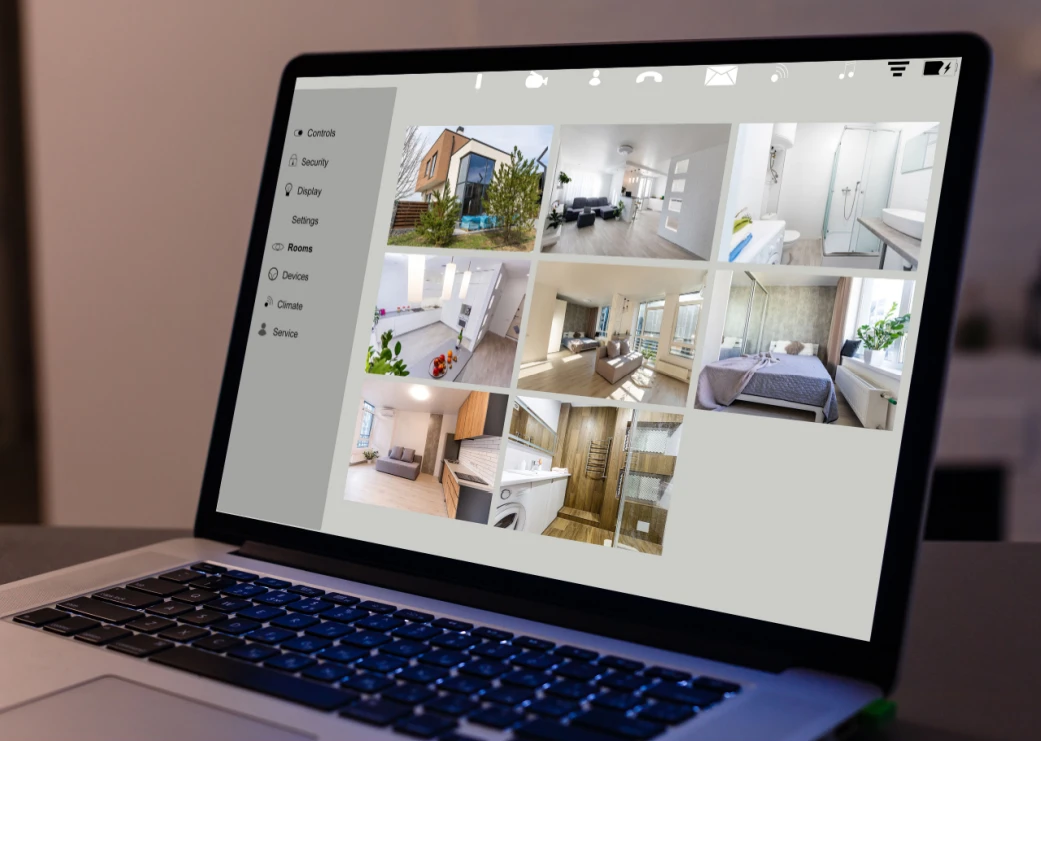
Help prospects picture daily life
Floor plans and amenities matter, but context matters too.
Prospects want to understand where they would actually live. They want to see how the building relates to the pool, parking, dog park, walking paths, nearby coffee, and the rest of the neighborhood. Static photos only get you so far.
Interactive aerial community maps help answer that question faster. They give prospects a better sense of place and make the community feel more real before a tour is ever scheduled.
When this works, the renter is not just looking at a unit. They are starting to imagine their routine.
Keep property information consistent across the site
One of the most common website problems in multifamily is duplicated property information scattered across multiple pages.
Office hours live in one place. Contact details live somewhere else. The address is hardcoded in a few templates. A leasing update gets made on one page but not the others. It creates inconsistency fast.
A better setup centralizes core property details so they can be reused throughout the site and updated once. That matters for user experience, but it also matters for accuracy, internal efficiency, and search visibility.
This is the kind of website infrastructure that does not look flashy in a mockup, but it makes a real difference once the site is live and teams need to keep it current. Brindle’s messaging consistently leans toward practical systems that reduce friction and support performance, not decoration for decoration’s sake.
Screen Your Tenant Today!
Gain peace of mind with AAOA’s credit, criminal, and eviction reports.
Use motion with restraint
Good websites have a feel to them.
Subtle transitions, micro-animations, and thoughtful movement can make a site feel more polished and more intentional. They can guide attention, smooth out navigation, and help the brand come across as more considered.
The operative word is subtle.
Too much motion becomes a distraction. The goal is not to show off. The goal is to make the experience feel smoother and more refined.
Done right, movement supports the brand and the browsing experience at the same time. It helps the site feel current without getting in the prospect’s way.
Show clear pricing early
Renters care about what they will actually pay each month, not just the base rent that got them to click.
When pricing feels incomplete, trust drops. When mandatory fees only show up later, objections go up. When the full monthly cost is clearer upfront, prospects can qualify themselves earlier and leasing teams spend less time handling avoidable friction.
That is why clear pricing matters so much on multifamily websites right now. It builds confidence, reduces surprises, and helps prospects make decisions with better information.
For marketing teams, this is also a conversion issue. Better clarity usually means better lead quality. That is a more useful outcome than generating a bigger pile of leads that were never a fit in the first place.
Make mobile action easy
Most apartment website traffic is mobile. Plenty of sites still behave like that is a minor detail.
If a prospect has to hunt for the schedule a tour button, scroll back up to find availability, or pinch through a clunky menu just to take the next step, the website is creating unnecessary friction.
Thumb-friendly design fixes that. Sticky calls to action, clean mobile navigation, readable layouts, and fast access to the pages renters care about all make the path easier.
This is not a minor UX choice. It is a leasing choice.
A website should make the next action obvious on a phone, because that is where a large share of apartment shopping happens.
What strong multifamily UX actually does
The best multifamily websites are not trying to impress with gimmicks.
They help prospects understand the community faster. They reduce uncertainty. They make pricing clearer. They make mobile action easier. They remove little moments of friction that quietly hurt conversion.
When that happens, the website starts doing real work.
It helps renters move forward with more confidence. It helps leasing teams spend less time correcting confusion. It helps marketing teams get closer to what they actually want: better leads, better tours, and a website experience that supports performance across the funnel.
Source: Multifamily Insiders


 Accessibility